Zoomerist | The Zoomerist | What is the Latest Colour Trend in Home Decor?

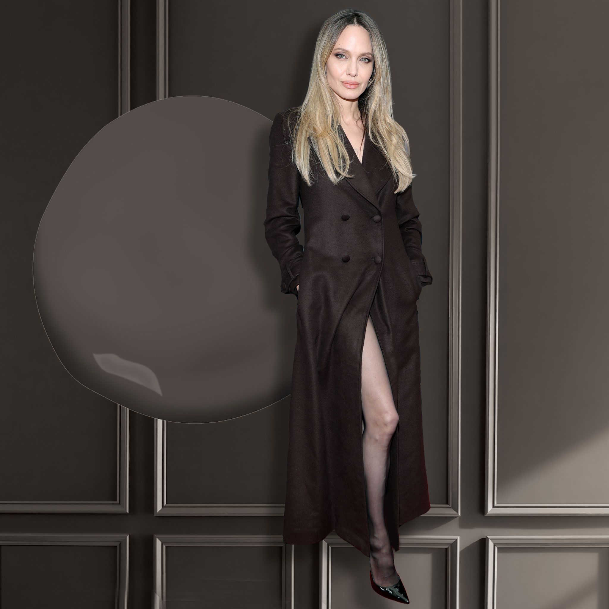
It is that time again, when forecasters reveal the next big things as one year rolls into the next. In decor, trend cycles are generally longer than in fashion, because let’s face it – no one is going to repaint every year unless they are hosting a decorating show. Still, we all want to know where the colour vibe is heading, and to that end, Benjamin Moore just announced its paint colour for 2026: Silhouette.
Sharon Grech, the colour marketing and development expert for the brand, describes the shade as “inspired by runway looks, expertly tailored garments and encompasses a richness that can transcend across any style.” It is, she adds, an “alluring blend of espresso tones and subtle notes of charcoal.” I love that colour theory has evolved to embrace the language of wine tasting!
So why brown, and why now? Grech says that there has been a major mood shift toward warm, natural tones in interiors for the past few years, and this is the logical next step. “Cool colours, grey interiors, have been going strong since about 2010,” she says. As the alternative to blacks and greys, “deep, rich chocolates, camels and tans have all moved to the forefront of popularity in the neutral colour space,” she says. Fear not, though; these aren’t “trendy” colours that will peak next year and then vamoose. “This is a return to timeless styles and design,” says Grech. We want value for our money, and that’s where classic style comes in. “Overall, we see people reaching for items with staying power, whether for their closet or home. There is a comfort and reassurance in these pieces, and in knowing that they can stand the test of time.” She calls these hues, in paint, restorative and sophisticated.
The fashion crossover is indeed strong here. We have seen brown on celebrities (think: Angelina Jolie in a swish double-breasted chocolate-brown trench dress by Gabriella Hearst on the TIFF red carpet this year), and lest we forget, Mocha Mousse was the Pantone colour for 2025. (Pantone is more heavily referenced in the fashion world.) In October, The New York Times ran a story by fashion editor Vanessa Friedman titled, “Why is everybody talking about brown?” In it, she cited examples of all shades of brown, both currently on the streets and moving forward in the spring 2026 collections across the fashion calendar. Her conclusion? People need to feel grounded right now. And what is more grounding than brown.
So how can you start to add this shade into your home? For those who want to dip their toes into deeper colours, Grech suggests the powder room, den or bedroom. If you are ready for a stronger statement, she says her favourite space for a deep brown is the dining room. “At night, with chandeliers, candlelight and reflective surfaces, it sets the perfect warm, sophisticated note for entertaining.”
You could drench a whole room (colour drenching, she reminds us, is to envelope a room in a single tone, trim and all), or you could do an accent wall. But this particular espresso/charcoal hue works with a variety of complementary shades – cool and warm, pale and mid-tone. “Everything feels elevated,” she says. For colour pairings, she likes to go with First Crush, a creamy white with a hint of blush, or Batik, a dusty violet and rose blend. If you prefer cooler tones, Grech offers Raindance, an easy-going blue-green with a touch of grey, or Swiss Coffee for a more traditional trim.
When it comes to furniture, you could go neutral, as the walls will draw attention to lighter pieces. Or, if maximum drama is up your alley, try a pop of fuchsia.
We can toggle back to fashion advice for some insight into how to switch to a browner palette without feeling like we are going full 1970s. It applies to decor, too. Friedman says to treat brown like the new black. Use it as an anchor for the shoes, bags and belts of your outfit (a.k.a the carpet, table and light fixture of your living room). Do like the Milanese and pair it with navy (so chic). But make no mistake, brown is here with us, in our closets and in our homes, for a nice, grounding stay.
Always asking questions,
—Leanne Delap


